 Fedigest
Currently, PieFed puts post thumbnails on the right, which is a bit unusual but looks more consistent when there is no thumbnail (which happens rarely). I've put together a visual showing how it could look with thumbnails on the left. What do you think?
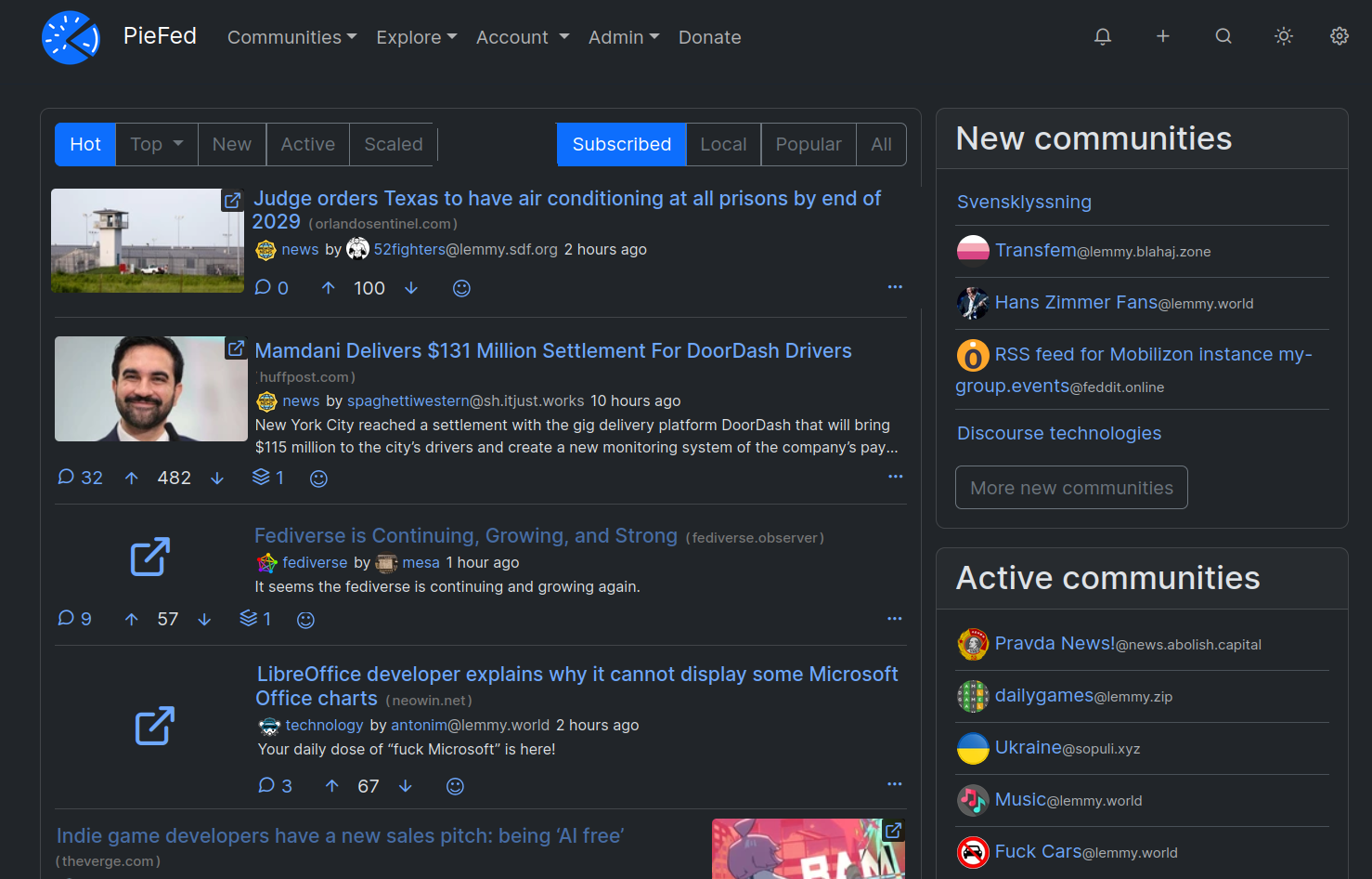
I wasn't sure whether to put the comment counts and voting buttons below the thumbnail or aligned with the text so I made examples of both. Please let me know in the comments about that.
Since I don't care about the image when I'm just quickly scanning posts, trying to bypass what I'm not interested in reading, having thumbnails on the left is a huge distraction that slows down the scanning significantly.
My eyes see the thumbnail first, which is not useful information, and then I have to scan right to begin a quick reading of the summary. If thumbnails are on the right, I immediately begin reading, and scanning goes much faster. I can ignore the noise.
I would find thumbnails on the left annoying. If this is implemented, please provide a choice.
Agree. I will add i do pay attention to the thumbnail but its the title i start with. It then serves as a leading line to the image which i consider the secondary layer of information.
I view by browser as I am trying to move away from apps.
Yes that was my original reasoning for putting them on the right. But I've come to realise that the thumbnails are perhaps somewhat useful just not in the concrete way that text is; an image sets the vibe, operating at a semi-conscious level.
Hm, I was thinking if I should vote for left or "I dont care" and ended up with voting left. I should have read your comment first, that would have tipped me over to "I dont care"
But yeah, agree on the make it a option the user can choose thing.
I'm using PieFed mobile most of the time, so the thumbnails are very small. I'd suggest to display them at full width on mobile. It looks very good in Voyager.
Yes good point, that is the norm. I've always thought it to be a massive waste of precious screen real estate but that's what compact mode is for I guess.
I agree, if you re gonna do thumbnails on mobile, do them like that.
That looks like the Not Compact - Expand Images option in the piefed settings.
Im pretty ambivalent.
I prefer images on the right since they are not on 100% of posts and really, really like the current layout on both desktop and mobile. I'm sure it is extra work to have both a left and right option, but would love to still have this current one I like stick around even if you make a new one with the images on the left.
I'm here to vote for the right (🤨) since I like that layout better, and am used to the app experience where you tap the thumbnail to see the image in full screen, tap the post title to open the comments. On the right is easier since I'm right handed, but I do feel like this is a good place to make an option.
Would making it a user option create unneeded overhead / backend stuff?
My thinking would be the same for a range of similar layout and functionality issues.
It wouldn't be very technically complex but it does make maintenance and testing more involved - not only would one need to test the 3 compact modes you'd also need to test the left vs right mode at each compaction level, so 6 different possibilities. That's just not going to happen so more bugs would slip through.
Ah, I don't know anything about the compact modes, but I also don't know how you juggle all this stuff. It seems like you must have extraordinarily careful notes and methodologies, and yet despite all that, there's always the other issue of having to deal with user-created headaches, especially as PF.S grows. Just... wow.
But yeah, thanks for explaining. I see now why you're wanting to make a hard choice in situations like this.
I voted "either is fine", though thumbnails on the left do look more natural to me.
That being said, I didn't really think about it until I saw this post. It's hard to have a strong opinion on the matter really.
I suppose the ideal thing is to make it into a setting, but that's easier said than done. 😆
~~Where are the other examples? I only see one image.~~
Edit: oh I see now, the posts are different in the same image.
I prefer the buttons aligned with the text.
Aligned with text definitely looks better to me.
I like the left aligned pictures design. It will make things more consistent on desktop too I think.
I feel like the whole post layout could be flipped horizontally - not only align thumbnail to the left but also align comments and voting buttons to the right. Post title is big enough to provide very large surface to click/touch and get to the content regardless of alignment while comments and vote buttons are small and a bit harder to select on mobile because you have to reach far away with your thumb. In my opinion it looks much better too but I guess that is rather subjective and prone to cultural bias.
Early versions of PieFed had voting buttons on the right, I loved it.
I like the vote buttons aligned with text more
Longer post titles currently push the post utilities bar below the thumbnail—alternatively, shorter titles and small or no body make it go the other way—and the options button from beside to under the thumbnail, or vice-versa. I feel this is a bug that probably belongs on a bug tracker (and may well be), but since we are on the subject, well…
The inconsistent behaviour is a bit weird, I know. But it was intentional - by making the 3 dots go beside the thumbnail when possible, the height of the teaser is reduced so more teasers fit on a screen at once. On average.
Edit: I like PieFed. I feel what I wrote sounded a bit too disappointed, and not all that constructive, and I don't want that to bother you. It really is no issue. PieFed is cool and enjoyable.
Original (-ish; I've already edited this too many times):
I figured. Don't particularly like it, but can't think of a good solution that would look or feel better, myself. Functionally, I just find it mildly off-putting to have to look for it when I realize it isn't below the thumbnail, where it appears—to me—to be more frequently. In truth, I'm not particularly bothered by it. I do like the overall format/layout, though.
Thank you.